Cobalt
Redesigning the Collection page
Transforming the standard, technical-only ad grid into a compatibility-focused, delivery-transparent system for tech buyers.
- Role
- Product Designer (Solo)
- Timeline
- March 2023 - June 2026
Context & Problem
The legacy implementation ran a generic retail merchandising pattern. Beneath that bug sat more structural gaps that compounded it — no faceted filtering against the buyer's actual spec sheet, no way to check machine compatibility before browsing, no visibility into real stock or delivery timing until checkout, and on-page category description copy carried over unedited from an unrelated apparel template.
For a buyer trying to answer does it fit and can I get it in time, the page answered neither — and the recirculation modules meant to build engagement (Similar products, Recommended products, Frequently viewed products) were simply missing.
Pages


Cobalt
Problem Discovery:
A platform with no pages yet
Context & Problem
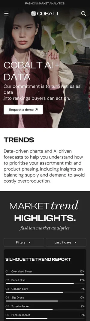
Cobalt's market intelligence — color, brand and silhouette rankings — existed only as internal reports, not a web product. There was no page for a buyer to browse trends, compare brands, or drill into a single ranked item.
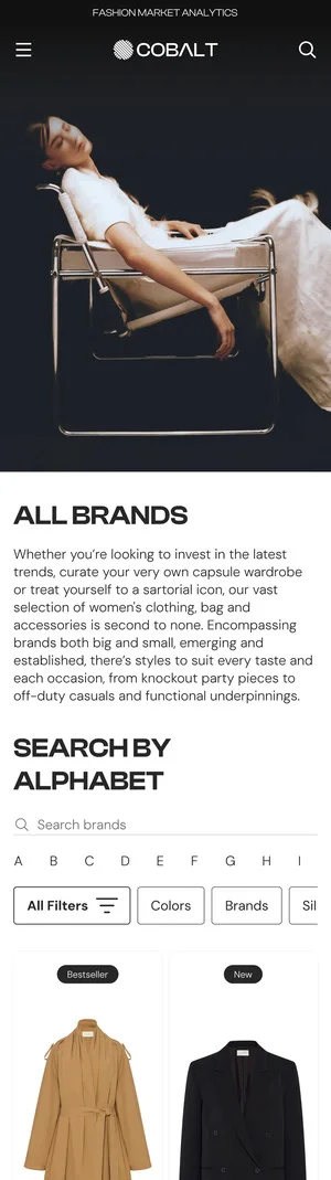
This case study covers designing that missing page set from scratch: a Home dashboard, dedicated Trend and Brand Intelligence pages, and a Product Page, each with a responsive version — so a subscriber can go from dataset to a specific, sourceable garment in a few clicks.
Cobalt
Key Pain Points
No central dashboard
Color, brand and silhouette rankings lived in separate reports and spreadsheets — there was no single page where a buyer could see all three at a glance.
No path from ranking to product
Seeing that a color or silhouette was trending didn't connect to anything sourceable — there was no link from an insight to an actual, buyable item.
No self-serve access
Every trend read required someone on Cobalt's team to compile and send a report by hand — buyers couldn't browse or filter the data themselves.
User flow
How a buyer moves through
the whole platform
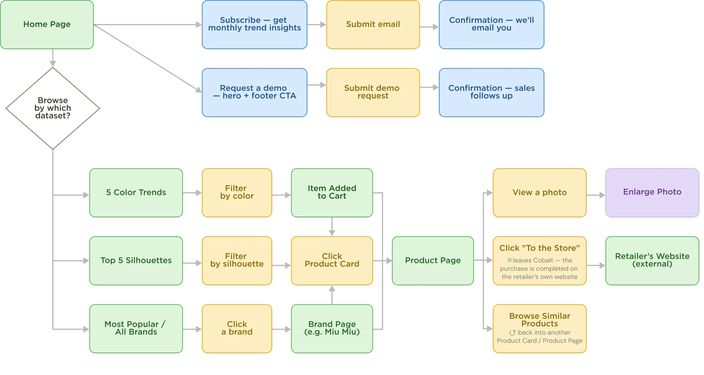
- Decision (availability check)
- Screen / page
- User action (button / click)
- Info module / badge
- Modal / popup (in-page interaction)
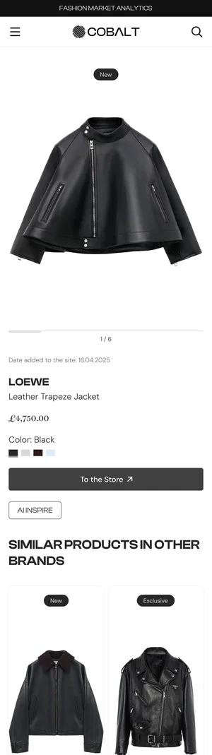
From the Home dashboard, a buyer reaches every dataset (colors, silhouettes, brands) and every product the same way, always through the same Product Page — where “To the Store” hands them off to the retailer's own site to complete the purchase. Cobalt's job ends at the insight, not the transaction.
Cobalt System Audit
pattern consistency,
not just a clean screen
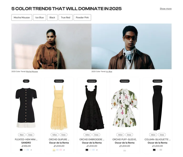
pattern

pattern breaks
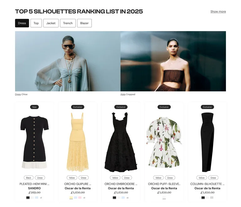
pattern
The top nav presents Colors, Silhouettes and Brands as three equal entry points to the platform's data. Comparing the three sections side by side checks whether the UI actually treats them as equal — or only two of them.
1 — The shared pattern (Colors & Silhouettes)
Both sections run the same formula: rank chips that double as filters, sitting on a 5-card grid. Ranking and filtering aren't two separate UI ideas here — they're the same row of elements. That's a systemized module, not five one-off screens.
2 — Where the pattern breaks (Brands)
The top nav presents Colors / Silhouettes / Brands as three equal entry points. Brands is the only one that reverts to a plain editorial grid — no rank chips, no product cards. Two of three datasets teach one interaction model; the third quietly teaches a different one, two scrolls later.
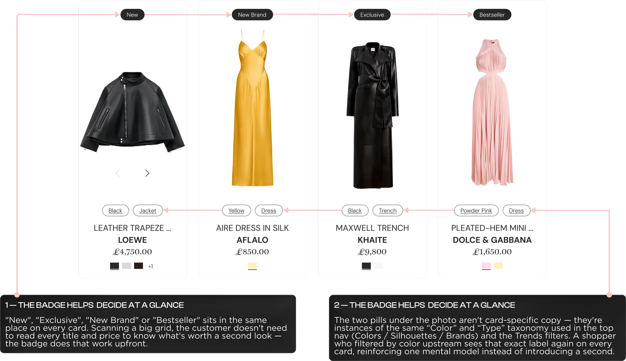
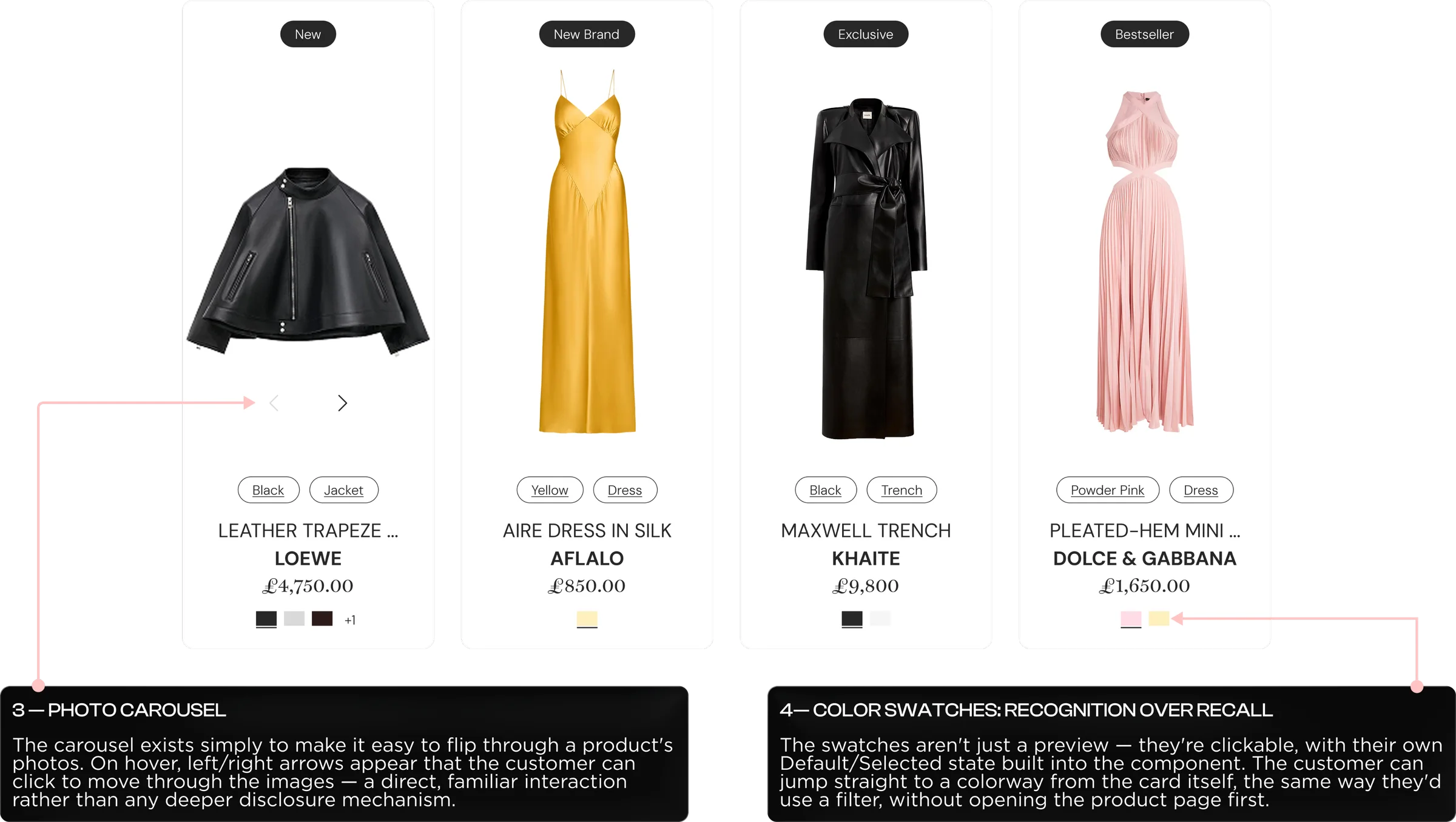
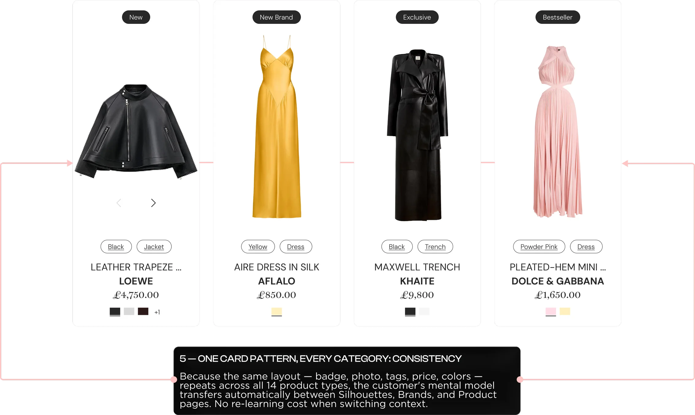
Cobalt Product Card
One card component,
built to carry the whole catalog
Cobalt System
How the page converts
in four stages

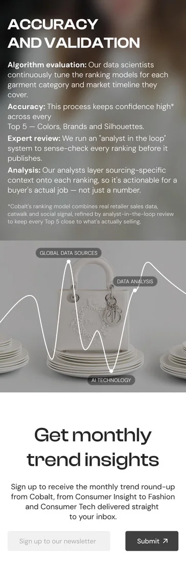

Same CTA, asked twice
- Header — Hero CTAAsk: Request a demo
Commitment: High - Accuracy & ValidationAsk: none — proof only
Role: builds trust - Confirmation — we’ll email youAsk: Email signup
Commitment: Low - Footer — Final CTAAsk: Request a demo
Commitment: High
- High-commitment ask
- Trust / proof only
- Low-commitment ask
Process description
Shown at mobile width — all five states fit in one row for easy comparison.
Two high-commitment CTAs (hero + footer) bracket a low-commitment one (Subscribe), with a trust section (Accuracy & Validation) doing the convincing in between. Different intent levels get different asks — nobody has to over-commit, and nobody leaves empty-handed.
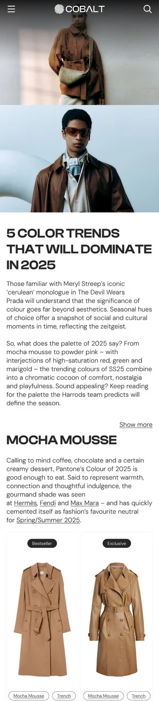
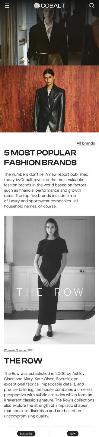
Same Nav Bar,
Three Different Experiences
Context & Problem
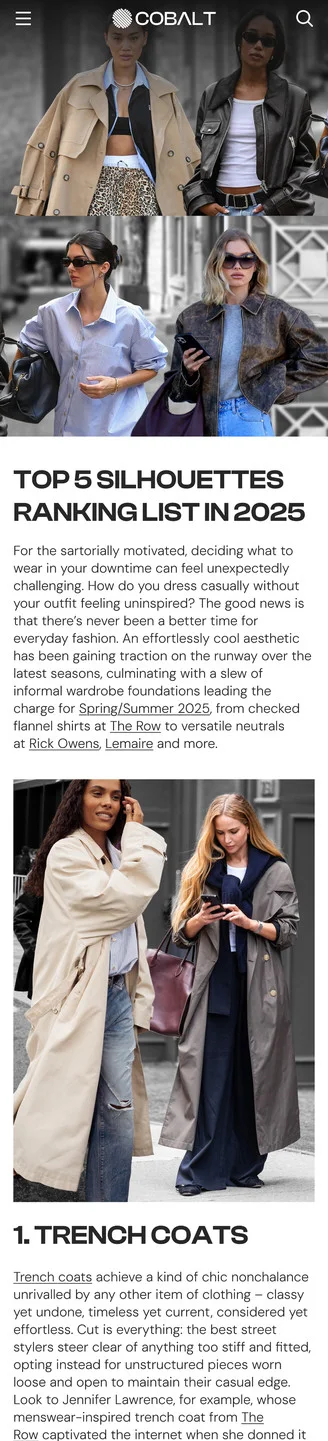
Colors, Brands and Silhouettes sit as three equal links in the top nav — same promise: browse Cobalt's ranked data. But the #1-ranked item on each page renders in a completely different layout. Colors shows a shoppable card grid — image, brand and price per item. Silhouettes drops to a loose row of plain photos with no cards. Brands drops further still, to one full-bleed editorial image and a paragraph — no way to compare items at all. A buyer's ability to scan and compare depends entirely on which dataset they happened to click, even though the nav promised the three were interchangeable.
Solution
Standardize the ranked-item layout across all three categories on the pattern that already works — Colors' card grid: image, brand and price per item, consistently sized and spaced. Rebuild the Brands and Silhouettes sections on that same grid instead of their one-off editorial layouts, so every dataset a buyer opens delivers the same scannable, comparable format. Consistency here isn't cosmetic — it's what makes the nav's promise of three equal categories actually true, and it removes the extra cost of re-learning how to read the page every time a buyer switches datasets.
Directory, Repeated —
The Differentiator Buried
Context & Problem
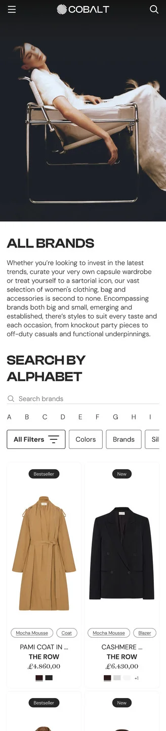
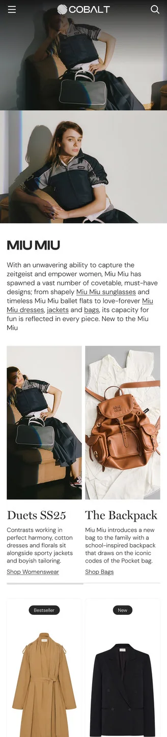
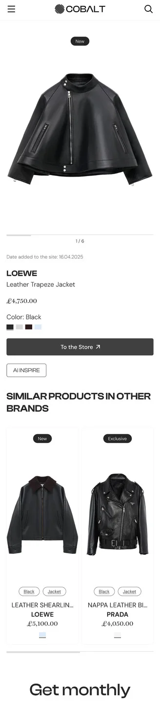
The path from All Brands to a specific product routes through pages that repeat the same content. All Brands leads with an A–Z directory, then drops into the same trend editorial cards ("Duets SS25," "The Backpack") a buyer already saw on Home and Colors; the Miu Miu brand page repeats those exact cards again under "Search Trends" before showing anything brand-specific. By the time a buyer reaches the Product Page, the one feature that reflects Cobalt's real value — cross-brand comparison via "Similar products in other brands" — sits below price, size and "To the Store," easy to miss for a buyer who decides, or bounces, before scrolling that far.
Solution
Give the All Brands page one job: let it be the A–Z directory, and move trend editorial content to the pages that already own it (Home, Colors, Silhouettes) instead of repeating it on every brand-adjacent page. On the Product Page, promote "Similar products in other brands" up near price and the CTA — it's Cobalt's actual differentiator, data-driven comparison across the whole market rather than one retailer's shelf — so it doesn't compete for attention with content the buyer has already scrolled past twice.
Trends Module
turning market data
into a buying decision
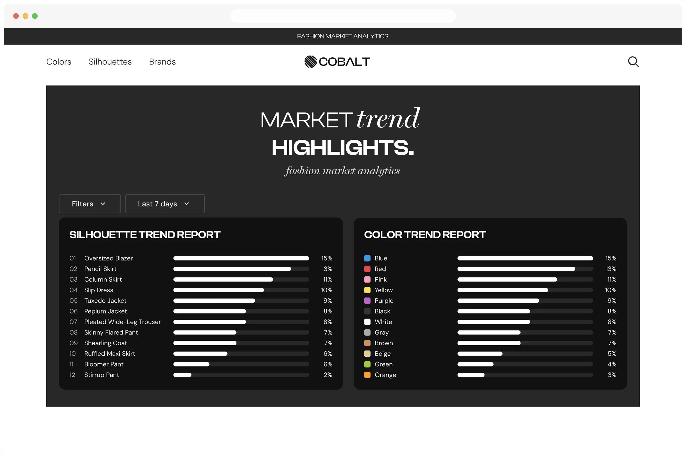
Why It Matters
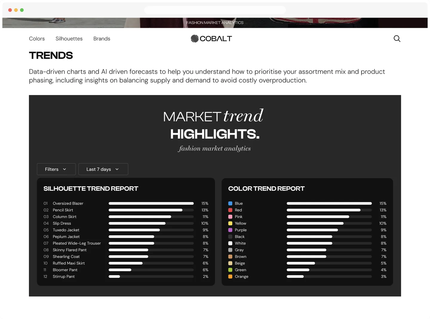
This is the one section where Cobalt stops describing the product and starts proving it. The framing copy states the buyer's actual job — prioritise assortment, avoid overproduction — before any chart appears, and the “Last 7 days” control scopes the data so it reads as a measurement, not an eternal truth.
Design Decisions
A ranked bar list matches the actual task: fast, preattentive reading of rank and magnitude. Color only carries meaning where it's real — hue-coded for Color Trend, one accent for Silhouette — and both panels share a single % scale so they're directly comparable. What's still open: no momentum signal, and “what's trending” isn't yet “what to reorder” — that gap is where the demo CTA picks up.
Cobalt
By the end,
What Changed
A single dashboard
Colors, Brands and Silhouettes now live on one Home dashboard — buyers see all three rankings at a glance, ranked from real sales data, no reports or spreadsheets required.
A path from ranking to product
Every ranked item now links to a Product Page, where "To the Store" hands the purchase to the retailer's own site — insight connects straight to something sourceable.
Self-serve access
Buyers now browse and filter Colors, Brands and Silhouettes themselves, on demand — no more waiting on Cobalt's team to compile and send a report by hand.
Lessons
What this project
taught me beyond this one flow
A shared nav is a shared promise
Colors, Brands and Silhouettes sit in the nav as three equal categories, but each one's sub-page uses a different layout — a shoppable grid for one, a bare editorial photo for another. Buyers read nav parity as a promise; breaking it quietly reads as inconsistency, not intentional variety. The same holds for any multi-category product: whatever the nav implies is equal has to actually behave equal.
The hand-off is still
part of the productCobalt's job ends at the insight — the actual purchase happens on the retailer's own site — but the sitewide flow had no explicit step for that exit. Adding "Click 'To the Store'" as its own labeled state, with copy that tells the buyer they're leaving Cobalt, turned an implicit link into a designed moment instead of a dead end in the flow diagram. Any product that hands a user off to someone else's system — a marketplace, an affiliate link, a partner checkout — owes that hand-off the same explicit design attention as everything before it.
Two similar CTAs can be
doing different jobs"Request a demo" and the newsletter signup both read as the page asking for an email, but they sit at opposite ends of buyer readiness — one is for someone ready to talk to sales now, the other for someone who isn't yet. Bracketing the page with the high-commitment ask and saving the low-commitment one for the middle kept neither segment over-committing or leaving empty-handed. The lesson generalizes past this page: any funnel with more than one entry point needs a CTA per intent level, not one CTA repeated at every scroll depth.